Built for the Camera Roll: Designing Stand Graphics for the Second Audience
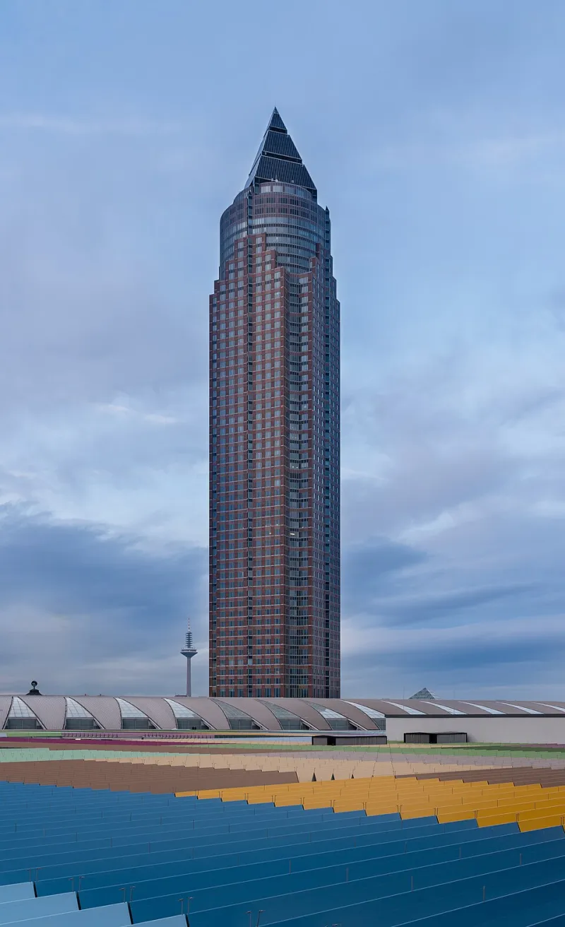
Photo: Norbert Nagel, CC BY-SA 3.0, via Wikimedia Commons
There is a moment at every UK trade show, usually around 11am on day one, when someone stops in the aisle, lifts their phone and takes a photo of your stand. They are not a photographer. They are standing slightly off-centre, the hall ceiling lights are bouncing off something, and they are going to crop the image to a near-square and post it before they have finished their coffee.
That photo is your second audience. It will be seen by more people than will ever stand in front of the stand itself. And yet most stand graphics are still specified as if the only viewer is someone walking past at eye level with good posture and plenty of time.
So here is the slightly uncomfortable question to ask in the design review: does this stand work as a photograph, or only in the room?
The aisle view and the feed view are not the same view
In the aisle, you have a few seconds of a visitor's attention, a decent viewing distance and a human eye that is very good at filling in gaps. On a phone screen, you have a thumbnail, a crop, and a viewer who is scrolling. The photo might be taken at 2m, then displayed at 6cm wide on a commuter train.
That changes the brief. Large display type that reads beautifully across a hall can turn into grey mush in a photo. Fine linework and subtle tonal gradients tend to disappear entirely. Meanwhile a bold block of one colour with a short word on it survives almost anything.
It is worth building in what I would call a photo moment: one vertical element on the stand, roughly in a 4:5 portrait ratio, that contains the brand name, the main proposition and nothing else. Vertical because that is how most people crop before posting. Nothing else because that is how it survives being seen at thumbnail size.
The 25% proof test before you approve anything
You do not need a colour-managed viewing booth to check this. You need an A3 proof and a phone.
Print your design at 25% of final size on the same substrate and finish you intend to use, or as close as your printer can get for a proof. Pin it to a wall. Stand back roughly 1.5m to 2m — which mimics the viewing distance of a phone photo taken of a full-size stand. Then photograph it with the phone you actually carry, once with flash off and once with flash on.
Look at the images on the phone screen, not on your monitor. Can you read the headline? Can you identify the logo? Is the QR code visible as a QR code, or has it become a grey square? If the answer to any of those is no, the design is not finished.
It sounds almost too simple to bother with, but it catches an enormous number of problems that look fine on a 27-inch screen in a quiet studio. It is also a very fast conversation to have with a client who is keen to sign off artwork.
Glare is the enemy, and gloss is its best mate
Trade halls are not galleries. They are big sheds with a mixture of downlights, uplights, daylight through roof panels and, at the NEC or ExCeL, whatever the lighting rig happens to be doing that week. Every glossy surface in that room becomes a small mirror.
Gloss laminate over a dark printed panel is the classic offender. It looks rich in the sample book and turns into a bright white smear the moment a spotlight hits it. If your stand relies on a dark, premium look, specify a matte or low-sheen finish and accept that you lose a little punch close-up in exchange for a lot of legibility at distance.
For rigid printed panels, matte anti-glare acrylic or a matte overlaminate on foamex will do most of the work. For tension fabric, look for a matte textile rather than anything with a sheen — fabric is generally better behaved under directional light anyway, because it diffuses rather than reflects. Avoid spot UV on any area that carries text or a logo; the highlight will land precisely where you least want it.
One practical tip: ask your printer for a sample under a desk lamp at an angle. If you can see the bulb, so will the phone camera.
Logos need a buffer, not a border
Logo safe zones are usually discussed in terms of print tolerance and bleed. For exhibition graphics, the more useful frame is photographic crop. A logo placed 20mm from the edge of a panel might be perfectly legal in pre-press terms and still get sliced in half when someone crops the photo to fit a LinkedIn post.
A working rule is to keep logos and key text at least 100mm from any edge, seam or structural element, and to check the finished graphic against the stand frame, legs and crossbars. Tension fabric in particular has a habit of pulling the design in slightly at seams, which can nibble into a logo that was already close to the edge.
It is also worth checking the logo against the panel colour, not just the brand guidelines. A logo that relies on a subtle two-tone contrast will often flatten out in a phone photo taken under mixed lighting, even if it looks crisp on the artwork.
QR codes: position them like a signpost, not a sticker
QR codes are now a normal part of stand design, but they are still frequently placed as an afterthought. A few things that make a real difference:
- Minimum printed size of around 25mm to 30mm square for a code scanned at arm's length, and a quiet zone around it that is at least four modules wide.
- Place the code between roughly 900mm and 1400mm from the floor, where a hand naturally reaches. Codes at knee height or above head height get ignored.
- Never put a QR code on a glossy surface. The reflection will stop a phone camera locking on.
- Put a short instruction next to it, not just the code. 'Scan for the spec sheet' beats a lonely square every time.
- Test the code from 1.5m under hall lighting with two different phones before you approve the artwork. Print proofs are not a reliable test for this.
Materials and finishes for mixed-light halls
If you are specifying for a hall with unknown or variable lighting, the safest combination is matte overlaminate on rigid panels, matte tension fabric for large-format backdrops, and a low-sheen finish on any counter or plinth graphics. These are not the most dramatic choices in a sample book, but they are the ones that photograph consistently.
For printed panels that will be reused across several shows, a matte anti-glare acrylic face on foamex or forex is a sensible balance of durability and photographability. And if you are investing in a hero wall that will appear in every photo, spend the extra on the finish rather than the size.
Give the photographer a frame worth taking
None of this is about making your stand look generic. It is about accepting that the photograph is now part of the visitor experience, whether you planned for it or not. A stand that reads clearly at 2m in a phone camera, with a matte finish, a sensible logo buffer and a QR code at hand height, will do its job twice: once for the people in the aisle, and once for the much larger audience on the feed.
Worth putting on the pre-show checklist, along with the extension leads.