A Hand's Width of Detail: Tactile Signage That Looks Built In
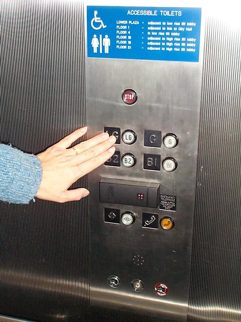
Photo: John Robert McPherson, CC0, via Wikimedia Commons
Tactile signage has a reputation problem, and it is not the braille. It is the way a perfectly good interior scheme suddenly acquires a beige plaque with a wonky acrylic backplate, fixed at a height that suits neither the door nor the eye. The statutory requirements are not the enemy here. The problem is that accessible signage is often specified after the joinery, lighting and paint have been signed off, so it arrives as an addition rather than a layer of the design.
Start with the route, not the plaque
Before anyone chooses a substrate, agree the wayfinding logic. A tactile sign is part of a route: you approach a door, you find the sign, you read it by hand and eye, then you move on. If the sign is in the wrong place, no amount of expensive material will rescue it. The Building Regulations' Approved Document M and BS 8300-2 give you the frame; the brand scheme gives you the finish. Bring both to the same table early.
That means an access consultant, the interior designer and the print supplier should be looking at the same door schedule. It sounds obvious. It rarely happens. When it does, you avoid the classic situation where the door has a glazed vision panel exactly where the sign needs to sit.
Contrast is a measured decision
Contrast is not a matter of taste. It is a measurable relationship between the sign and its background, and it needs to survive real lighting. A dark blue plate on a dark grey wall may look sophisticated on a mood board, but it can disappear in a dim corridor. A difference in light reflectance value of around 70 points is a sensible target for critical wayfinding elements, but check the actual figure with your supplier rather than trusting a screen proof.
Do not rely on colour alone. Red on green can read as similar tones to some users. Use tone, not just hue. A matte finish helps: gloss surfaces throw reflections, hide lettering and show every fingerprint from the person who has just found the sign by touch.
Braille, raised type and the honesty of the edge
Braille should be produced as raised domes, not printed ink. That sounds basic, but printed braille still turns up because it looks neat in a PDF. It is not readable by touch, and it will not pass a sensible access review.
Raised lettering usually reads best at around 0.8 to 1.5 mm proud, with a clean edge and enough spacing that fingers can distinguish one character from the next. The letterforms should be simple. A condensed, high-contrast sans serif works harder than a decorative brand font. If the brand font has thin strokes and fussy terminals, use a companion face for the tactile layer and keep the brand for the visual layer.
The edge of the sign matters too. A chamfer or radius stops the plate feeling sharp, and it helps the sign look considered rather than cut from a sheet in a hurry. If the plate is thick, check that the braille and lettering are not lost in a deep frame.
Heights, reach and the door-side test
Door-side signs commonly sit with the bottom edge around 900 to 1000 mm from the floor; general wayfinding often sits higher, in the 1400 to 1700 mm band. The exact figure depends on the user group and the venue, so agree it with an access consultant early. Do not let a joiner set the height because that is where the stud is.
A simple test is to stand at the door with your hand relaxed at your side. Can you find the sign without crouching or reaching? Can you read the visual line at a glance? If the answer is no, the sign is in the wrong place, whatever the drawing says.
Materials that survive the wipe
Tactile signs get touched, cleaned and occasionally used as a leaning post. Matte acrylic is common, but it can scratch. Powder-coated aluminium is robust and takes colour well. Brushed stainless looks sharp but can be cold and reflective. Solid surface materials can be routed and finished beautifully, but they need a fabricator who understands the tolerances.
Ask about cleaning before you fall in love with a finish. A textured surface that traps dust is a bad idea in a clinic. A dark gloss that shows every mark is a bad idea in a school. A light matte face with a contrasting dark tactile layer is often the practical answer, provided the contrast is measured rather than guessed.
Fixings and the integration trick
The best fixing is the one you do not notice. Standoffs can look like an afterthought, especially when they are chrome and the rest of the scheme is brushed brass. Concealed plates, locator pins or a backplate that matches the wall can make the sign sit into the interior rather than on top of it.
If you are using adhesive, make sure it can be removed without taking the paint with it. If you are using mechanical fixings, agree the hole positions before the wall is finished. The holes you did not plan for are the ones that end up in the wrong place.
The sign-off checklist
Before the artwork is released, check the route, the mounting height, the contrast figure, the braille specification, the raised lettering depth, the fixing method and the cleaning regime. Then look at the sign in the actual lighting, at the actual distance, with the actual wall finish behind it. A tactile sign is not a compliance sticker. It is one of the few parts of the interior that every visitor will physically touch. It should feel like it was designed to be there.