The Noticeboard Is a Product: Internal Print That Earns Its Wall Space
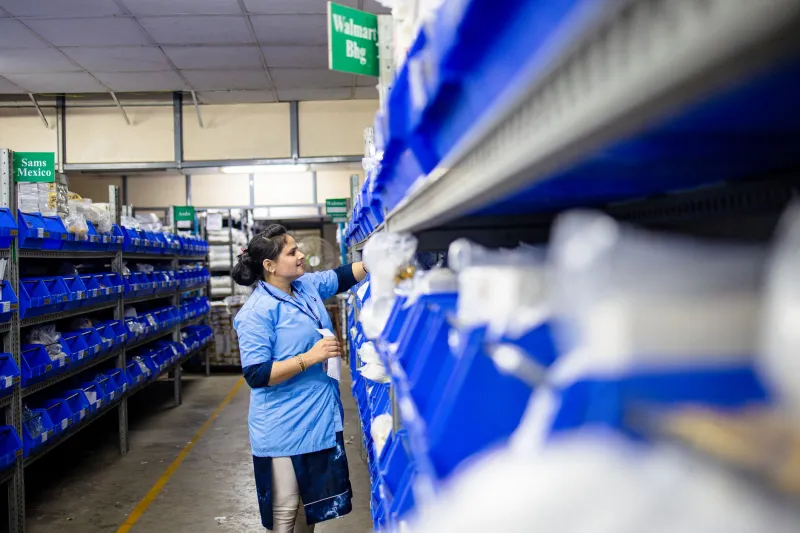
Walk into almost any UK warehouse, office or retail back-of-house and you'll find the same object: a noticeboard. It's usually a cork panel, sometimes a whiteboard, occasionally a laminated sheet taped to a pillar. It holds fire action notices, a shift rota, a training reminder, a poster about the staff Christmas do, and something curling at the bottom corner that was relevant in March.
Nobody designed it. That's the problem. Internal graphics get treated as admin rather than as a display job, and the result is a wall that everyone walks past and nobody reads. The fix isn't more notices. It's a bit of specification discipline — the same discipline you'd apply to a window campaign or a trade stand, just aimed at an audience of twelve rather than twelve thousand.
Start with the wall audit, not the artwork
Before anyone opens a design file, walk the route your staff actually take. Clocking-in point, corridor, break room, loading bay, team leader's desk. Note what's already there, how old it is, and whether anyone looks at it.
You'll usually find three things. First, duplication: the same fire procedure in two places, both slightly different. Second, dead weight: notices for events that finished months ago. Third, orphan notices: a hand-written sheet about parking that has been there so long it's effectively part of the building.
A simple audit table works fine — location, message owner, review date, frame type. It sounds bureaucratic for a break room, but it's the difference between a managed system and a collage. Once you know who owns each message, you can decide whether it needs a permanent frame or a temporary slot.
Give messages a hierarchy and stick to it
Most internal walls fail because everything shouts at the same volume. A fire action notice, a rota and a birthday card all compete at A4. Staff learn to filter the whole wall out.
A workable hierarchy for most back-of-house areas looks like this:
- Statutory and safety — fire action, first aid, COSHH where relevant, manual handling reminders. These get permanent, fixed frames in consistent positions. They don't move.
- Operational — shift patterns, daily targets, picking rates, delivery schedules. These change weekly or daily and need a changeable frame that's easy to update without tools.
- Developmental — training reminders, toolbox talks, new process sheets. Changeable, but reviewed monthly.
- Social — birthdays, charity events, the quiz night. One dedicated board, clearly separated, so it doesn't contaminate the operational stuff.
Once that hierarchy is visible on the wall — literally, by using different frame styles or positions — people stop reading everything and start reading what matters to them that day.
Frames do the heavy lifting
For anything that changes more than once a quarter, a snap frame is the sensible default. Aluminium snap frames in A4 and A3 are cheap, available in silver or black, and let a team leader swap a sheet in seconds without hunting for the laminator. Wall-mounted poster hangers work well for long shift boards. For high-traffic corridors, consider lockable frames if you've had issues with notices being moved or removed.
A practical detail: mount frames at a consistent height, usually around 1.4 to 1.5 metres to the centre, and align them to a grid. It sounds fussy, but alignment is what makes a cluster of notices read as a system rather than a pile. It also makes it obvious when something is out of place.
If you're specifying for a warehouse or production area, check the frame fixings against the wall substrate before you order. A snap frame screwed into plasterboard with the wrong fixings will be on the floor within a month. The same rule applies here as on an exhibition stand: fixings are part of the specification, not an afterthought.
Substrates that survive real back-of-house conditions
Paper behind glass is fine in an office. In a warehouse or a retail stockroom, it's a short life. Choose substrates based on where the graphic is going, not what's cheapest per sheet.
- Encapsulated or laminated paper — good for temporary operational notices in dry, low-touch areas. Cheap and quick.
- Polypropylene or PET sheet — wipe-clean, tear-resistant, and suitable for areas where hands are grubby or surfaces get cleaned down. A sensible default for shift boards and training reminders.
- Rigid PVC foam board — useful for permanent safety notices that need to stay flat and rigid without a frame.
- Self-adhesive vinyl — only where the surface is suitable and the message is genuinely long-term. On a painted breeze block wall in a warehouse, it will fail. On a smooth door or cabinet, it's fine.
One overlooked point: print method affects legibility under real lighting. In a break room with fluorescent strips and a window, a heavily coated gloss laminate can throw reflections that make text unreadable from two metres. A matt or satin finish is usually the safer choice for internal notices. If you're printing colour-coded safety information, check it under the actual lighting before signing off — colour shifts are common between screen and print, and more so between print and a sodium-lit loading bay.
Templates stop the drift
Internal print drifts because everyone makes their own. The antidote is a small template set: one layout for statutory notices, one for operational updates, one for training, one for social. Each with fixed type sizes, a clear headline zone, a date field and a named owner.
Keep the template in a shared folder and make it genuinely easy to use. If updating a shift board takes longer than finding a marker pen, people will go back to the marker pen. A simple Word or PowerPoint template printed to PDF is usually enough. The point is consistency, not sophistication.
Set a review rhythm too. A monthly ten-minute walk with the audit sheet catches the dead notices before they become wallpaper. Some sites tie this to an existing safety walk so it doesn't become a separate job.
The small stuff that makes it work
A few practical habits make the difference between a system that lasts and one that decays by spring:
- Put a date on every temporary notice, in the same corner, every time. Anything past its date comes down.
- Keep a small stock of blank frames and pre-cut polypropylene sheets so replacements don't wait on a print order.
- Use the same typeface across all internal graphics. It's a small branding decision that makes the wall look intentional.
- Position the most time-critical message at eye level on the route people actually walk, not on the wall behind the kettle.
- If your site has multiple languages spoken on the floor, plan for that in the template from the start rather than adding translated sheets later at a different size.
None of this is glamorous. But internal graphics are read more often than most campaign work — daily, by the same people, in the same place. That makes them worth specifying properly. Treat the noticeboard as a product with a user, a job to do and a maintenance schedule, and it stops being background noise. It becomes the most-read display in the building.