Don't Print Into the Dip: Graphics for Containers, Cabins and Modular Units
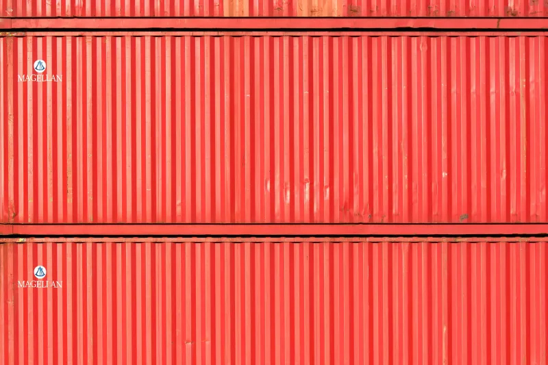
From ten metres away, a shipping container looks like a big flat rectangle with a door on one end. From one metre away, it looks like a series of hills and valleys with a door on one end. That gap between the two views is where a lot of print budget goes missing. The logo looked crisp in the PDF. On site, half of it is sitting in a shadowed dip.
Corrugated metal containers, modular retail units and site cabins are everywhere in the UK now: festival compounds, construction welfare blocks, temporary retail yards, pop-up food courts, storage yards dressed up for a launch. They are useful, robust and relatively cheap to hire. They are also three-dimensional objects pretending to be flat walls. Specifying graphics for them is not the same job as wrapping a smooth van or printing a foamex panel.
The wall is not a wall
Shipping containers usually have a trapezoidal corrugation running vertically. The pitch and depth vary by manufacturer, age and unit type, so there is no single magic number to design around. What matters is that the profile exists and your artwork has to accommodate it.
If you apply vinyl directly over the ribs, the material bridges the high points and dips into the valleys. On a simple block colour, that can look fine. On fine type, hairlines, detailed illustrations or a QR code, it can look like a mistake. The ribs cast small shadows, break up edges and make thin elements appear to wobble. At eye level, a 10 mm line can disappear entirely.
Rigid panels fixed over the corrugation avoid the bridging problem, but they introduce a different one: depth. A flat panel sitting over a ribbed wall creates a gap. That gap needs closing, draining or hiding. If it is not, it becomes a trap for water, leaf litter and the kind of British weather that finds every small opening.
Either route can work. The mistake is designing as if the substrate is flat and hoping the installer can fix it later.
Design for the profile, not the PDF
The most practical starting point is a site survey with a ruler and a camera. Photograph the wall straight on, then take a close-up with a tape measure across the ribs. Note the rib depth, the pitch, the position of doors, vents, lashing points, warning labels and any existing dents. If the unit is a cabin, note the windows, flues, vents and access panels. Those are not details for the installer; they are design constraints.
On the artwork side, think in broad bands rather than delicate detail. Large logos, chunky type, strong colour blocks and simple shapes survive corrugation far better than fine print and intricate patterns. If a phone number or web address must be readable, put it on a flat panel, a door sign or a separate board rather than running it across a ribbed field.
QR codes deserve their own warning. They need a clean, high-contrast area and enough quiet zone around them to scan reliably. Put one across a ribbed surface and you are asking a phone camera to do geometry under pressure. Give it a flat patch or leave it off the container entirely.
Bleed and overlap also need more thought than usual. If a graphic is being applied in sections, allow enough overlap to follow the profile without stretching the design out of shape. If a panel is being fixed over the ribs, make sure the visible edge lands somewhere sensible, not halfway through a line of type.
Expansion, contraction and the weather
Metal moves. A container in a sunny yard can get uncomfortably hot on the surface and then cool down sharply in the evening. Over a season, that thermal movement works on adhesive and fixings. A vinyl graphic applied tight across a ribbed wall has nowhere to go when the metal expands, so it can lift, tunnel or split at the high points.
Leave expansion gaps at panel edges and allow the material to follow the profile rather than fighting it. For short campaigns, a conformable cast vinyl applied by an experienced installer can work well on shallow corrugation. For longer installations, or deeper profiles, a panel system on a subframe is often the calmer choice. It costs more upfront, but it gives you a flat face for artwork and a predictable edge detail.
Condensation is the other quiet destroyer. Site cabins and modular units are often cold steel boxes with warm interiors, and that combination can put moisture behind graphics. If you seal every edge of a panel tight against a cold wall, you can trap that moisture and create a lovely little greenhouse for mould and rust. Stand-off panels, drainage gaps and ventilation routes are not over-engineering; they are what stops the graphic from becoming a damp problem with a logo on it.
Fixings decide the job
There are several ways to get graphics onto a corrugated unit: direct vinyl, rigid panels, tensioned banner frames, clamp bars or a combination. Each has a different effect on the artwork and the wall.
Self-tapping screws into the ribs can be secure, but every penetration is a potential leak. If the unit needs to stay watertight, use sealed washers and think carefully about where the fixings land. Fixing into the valleys is often easier to hide, but it can interfere with the profile and make the panel sit unevenly. Clamp bars and rail systems avoid some of that, provided the rails are fixed to a sensible part of the rib.
For cabins, never cover ventilation louvres, flues, access hatches or safety labels. It sounds obvious until you see a beautifully branded welfare unit with a blocked vent and a fire extinguisher sign hidden behind a vinyl panel. Leave the operational bits operational.
The commercial case for fewer details
The temptation with a container or cabin is to treat it as free advertising space and fill every inch. But the profile is already editing your artwork for you. The more detail you add, the more of it will be lost, distorted or hidden by shadow.
A simpler design, specified for the wall, usually looks more confident and costs less to install. It also survives longer. Ask your printer or installer for a profile sample or a paper template before sign-off. A few minutes with a ribbed offcut can save a full reprint. And if the unit is being hired for the 2026 festival season, check what the hire company allows in terms of fixings and removal. Some yards are relaxed; some are not.
The container is not a billboard. It is a lumpy steel object with a door. Design for that, and the graphics will earn their keep long after the first photograph.