Point Size Is a Desk Number: Sizing Type for Real UK Viewing Distances

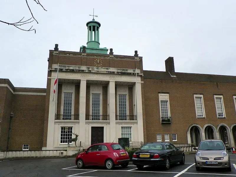
Photo: large format typography on building fascia sign exterior, via 121clicks.com
Most signage gets signed off at 100% on a 27-inch monitor, viewed from roughly 60cm. It then gets produced at four metres wide and read from the far side of a car park. Somewhere between those two moments, the question of whether anyone can actually read the thing quietly falls off the to-do list.
This is not a piece about typography. It is arithmetic — the working numbers you can put in front of a client, a brand team or a printer when someone insists the strapline has to sit on the same line as the logo.
Point size is a screen number. Cap height is a sign number.
A 72pt headline means nothing once it leaves your design software. What a reader resolves at distance is the physical height of the letters — specifically the cap height, and for lowercase text the x-height.
Two typefaces set at identical point sizes can differ by 15% in cap height and closer to 25% in x-height. A geometric sans with a small x-height reads noticeably smaller across a hall than a workhorse grotesque at the same nominal size. So specify in millimetres of cap height and let the designer work backwards from there.
The rule of thumb, translated
The old imperial guide for exterior signage was one inch of letter height for every ten feet of viewing distance. In metric that lands at roughly 25mm of cap height per 3m, or about 8mm per metre. Then round up, because the rule assumes near-perfect conditions.
| Viewing distance | Baseline cap height | Practical artwork spec |
|---|---|---|
| 2 m | 17 mm | 20 mm |
| 5 m | 42 mm | 45 mm |
| 10 m | 83 mm | 90 mm |
| 20 m | 165 mm | 180 mm |
| 30 m | 250 mm | 275 mm |
| 50 m | 415 mm | 450 mm |
All of this assumes a static reader, strong contrast, reasonable light and a message short enough to take in during a glance or two. Break any one of those and the numbers climb.
The multipliers nobody puts in the brand guidelines
Movement
A pedestrian walking past a pavement board gives you perhaps two seconds. A driver at 20mph gives you less. Add 30–50% cap height if the reader is moving, and sit at the top of that range for roadside totems and escalator graphics where the eye has even less time to settle.
Contrast
Dark type on a light ground reads further than light type on a dark ground, which tends to halo and bloom — worse still on gloss or backlit substrates. If the palette insists on reversed-out white, pay for it in size and weight.
Weight and counters
Light weights vanish at distance. Hairline strokes break up, and tight counters fill in, especially on textured or perforated material. Go one weight heavier than feels right on screen. Keep tracking neutral to slightly tight; heavily spaced capitals read as a run of separate letters rather than words.
Lighting
A fascia facing north under a canopy at 4pm in February is a different proposition from the same artwork in July. Retroreflective or externally illuminated material buys back some of that. Matte finishes avoid glare hot spots, and dark backgrounds can disappear entirely at dusk.
Dwell time
The one that always gets forgotten. Someone studying a floor plan in a shopping centre will happily read 6mm text. Someone glancing at a hanging banner from thirty metres will not read anything at all.
Where the table cheats
Pavement boards and shelf-edge strips work at very short range, so a 1.5–2m viewing distance suggests 15–20mm caps and that is perfectly adequate — provided the headline is four or five words. Most A-boards fail not because the type is too small but because there is too much of it. A 20mm headline with four words makes a decision; a 20mm headline with nine words is wallpaper.
Exhibition wall graphics sit at 1–3m, so 25–40mm caps carry body content comfortably. But the headline meant to stop traffic in the aisle needs pitching at the 10–15m column instead, not at the size that looked tidy in the layout.
Shelf-edge and point-of-sale graphics are their own case: 300–600mm from the eye, but often read at an angle, under strip lighting, by someone pushing a trolley. Short words, heavy weights, and a hard limit of one or two lines.
Accessibility is a sizing question too
BS 8300-2 and RNIB signage guidance push in the same direction: bigger, bolder, higher contrast. For wayfinding and critical information, aim for a strong luminance contrast between text and background — a difference of around 70 points in light reflectance value is a common target. Avoid thin weights, decorative scripts and fine serifs. Sans serif, medium or heavier, sentence case for anything longer than a couple of words. Setting a long strapline in all caps at distance is a legibility tax you simply do not need to pay.
A worked example
Picture a 6m fascia on an industrial estate unit, read from the access road about 12m away by drivers doing 20mph.
Base figure at 12m: roughly 100mm cap height. Add 40% for movement: 140mm. Round to 150mm and move on.
Then check it fits. Average character width in a decent sans is around 0.55–0.65 times the cap height, so allow 90–100mm per character including spacing. A 6m fascia gives you roughly 60 characters on a single line at that size. If your brand lock-up, descriptor and web address run to 90 characters, something has to give — and it should be the web address, not the letter height.
The sign-off list
- Specify cap height in millimetres, never point size.
- State the viewing distance and whether the reader is walking, driving or standing still.
- Describe the light: direction, time of day, artificial illumination, reflections off glazing.
- Confirm material finish. Matte generally beats gloss for reading; gloss beats matte for punch.
- Print the artwork at 10% and stand back a tenth of the viewing distance. Cheap, brutal, effective.
- Get fire performance and durability certificates before installation, not after.
None of this replaces a designer's eye. It just gives you a number to argue with when the deck says make the logo bigger and the site says otherwise.