When the Shutters Are Down, the Hoarding Is the Shop
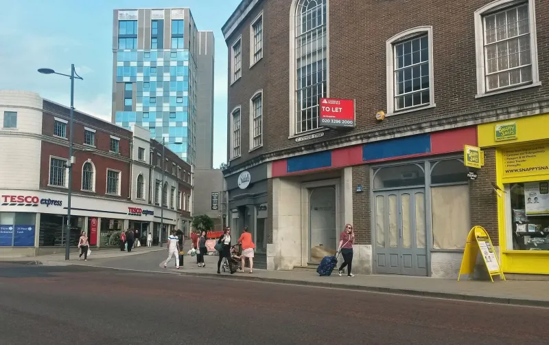
There is a particular kind of high street sadness: a unit wrapped in plain ply, a single A4 sheet saying “Sorry for any inconvenience”, and a logo that has been photocopied so many times it looks embarrassed. The store is closed, but the brand is still on display. For months. In a busy location, that hoarding may get more attention than the shop did on a wet Tuesday in February.
That is the shift in thinking. A retail refit hoarding is not a last-minute print job tacked onto the construction programme. It is a temporary media space with its own specification, its own audience and its own maintenance needs. Treat it like a six-month shopfront and it can build anticipation, explain the project and keep the brand looking credible while the dust sheets are out.
Start with permissions, not Pantone
Before anyone gets excited about a bold colour palette, check what you are actually allowed to put on the hoarding. In the UK, the lease, landlord’s design guide and local planning authority all have a say. Construction hoardings often sit within permitted development for the works themselves, but branded graphics, illumination, projection or anything that reads like advertising can trigger advertisement consent requirements. Conservation areas and listed buildings add another layer. So does a landlord who wants the whole parade to look tidy.
Get approval in writing for the size, position, fixings, colours and any lighting. If the hoarding projects onto the pavement, check licensing and accessibility. If it is a scaffold wrap, check the scaffold designer’s wind loading and fixing details. None of this is glamorous, but a beautifully printed graphic that has to come down after a week because nobody asked the landlord is an expensive way to learn.
Build for the British weather, not the render
A refit hoarding lives outside for months. It gets rain driven sideways, UV, pollution, pigeons and the occasional enthusiastic commuter. Paper posters behind acrylic are fine for a fortnight; they are not a six-month plan.
For long-duration graphics, start with the substrate. Aluminium composite panel or rigid PVC panels mounted to a timber or steel frame give a flatter, more durable face than vinyl applied directly to rough ply. If you are printing onto ply, it needs to be smooth, primed, sealed and dry. Edges matter more than people expect: water gets in, vinyl lifts, and the whole panel starts to look tired. Specify sealed edges, stainless fixings and expansion gaps where needed.
Then think about the surface. Anti-graffiti laminate is not a magic force field, but a sacrificial or cleanable laminate makes a real difference in town centres and near transport hubs. Ask how it should be cleaned and what solvents are safe. A laminate that survives the graffiti but discolours after the first wash is not a win. Also check fire performance requirements with the venue or landlord, especially where the hoarding sits near escape routes or shared access ways.
Design for the pavement, not the boardroom
The hoarding will mostly be seen by people walking past at one to three metres, often while dodging buggies, bins and delivery bikes. That changes the design rules. Your main message should sit around eye level, roughly 1.2 to 1.8 metres from the pavement, not down by the kerb or up near the scaffold clips. Type needs to be large, contrast needs to be strong and paragraphs need to be short.
Assume partial occlusion. A bus shelter, a bin, a parked van or a queue outside the neighbouring café may cover part of the hoarding for most of the day. Put the brand and the key message in more than one place. Keep vital information out of the bottom 400mm, where it will be splashed, kicked or hidden. If you are using QR codes, make them big and test them from the pavement, not from the design file on a 27-inch monitor.
A useful structure is a panel system: one hero brand panel, one “what’s coming” panel, one opening-date module and one contact or recruitment panel. That gives the hoarding some rhythm and makes updates practical. It also stops the whole thing becoming a single enormous poster that has to be reprinted because one date moved.
Make the date a module, not a headline
Opening dates slip. We all know this. If the date is baked into the main artwork, a two-week delay becomes a full reprint. If it sits in a separate framed insert or changeable panel, it becomes a morning’s work.
Plan for version control from the start. Decide who owns updates, how long reprints take and whether the site team has spare blank panels or date strips. Avoid building up layers of vinyl patches; they look messy and start to peel. A locked aluminium frame with printed inserts is less exciting than a full-wrap mural, but it is far easier to live with when the programme shifts. For longer refits, use seasonal language (“Opening spring 2026”) rather than a hard date, or point people to a webpage for the latest information.
The boring bit that saves the brand
A hoarding needs a maintenance plan. Someone should check it weekly for lifted edges, water ingress, graffiti and tears. Keep a small touch-up kit and a replacement panel or two on site. Anti-graffiti surfaces still need cleaning; they just make it easier. And when the hoarding finally comes down, make sure the graphics are removed cleanly and the panels are disposed of or recycled according to the contractor’s waste plan.
None of this is as thrilling as choosing the hero image. But a refit hoarding is a shopfront before the shop. Specified properly, it can introduce the new space, reassure customers and keep the street looking alive. Specified badly, it is six months of apologising in public. The choice is mostly made before the first print file is sent.