Queue-Side Branding: Making the Payment Wall Earn Its Keep
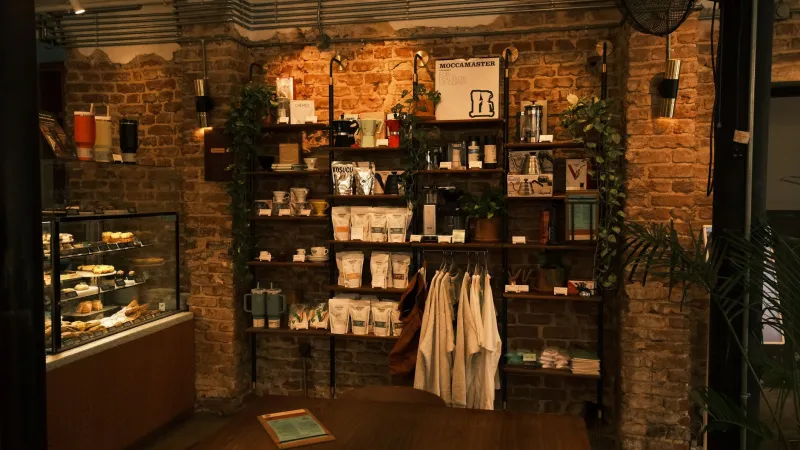
Most independent retailers spend their visual merchandising budget on the window. That makes sense: the window brings people in. But once someone is inside and waiting to pay, the wall behind the till becomes the most-viewed surface in the shop. Customers stare at it while a card terminal thinks about its life choices. They read it while a receipt prints. They photograph it when a friend is buying something. Treat that wall as queue-side media, not leftover decoration, and it will work harder than a lot of the printed material you paid for.
Design for the queue, not the mood board
Start by standing where customers stand. Measure the likely queue length, note the till height, and check what blocks the view: card readers, receipt printers, staff monitors, charity boxes, bags. The best backdrop reads from one metre and from four. Keep the main brand message in the upper half, roughly between 1.4m and 1.7m from the floor, and keep smaller text out of the area where staff reach across the counter. If the shop has a narrow queue, design a tight central composition; if people wait along the length of the counter, use a repeating or panoramic layout. Do not put essential information at the edges, where it will be cropped by shelving or a passing shoulder.
Rigid panels: crisp, but plan the edges
Foamex, aluminium composite and acrylic give a clean, flat finish and hold strong colour well. They suit small walls, brand marks and wipe-clean retail environments. The catch is installation. Direct screws into plasterboard are quick but rarely lease-friendly, and heavy panels need proper fixings into studs or a batten system. Ask for a fixing plan before you approve artwork. Visible edges matter too: a 3mm panel with a raw cut can look cheap under spotlights, so specify a clean cut, a printed wrap or a slim frame. If you are renting, consider a panel mounted on a removable hanging rail or a shallow frame that spreads the load and keeps fixing points to a minimum. Test any adhesive on an inconspicuous patch first; paint and plaster in older UK units can behave badly.
Removable wallpaper: flexible, but prep is everything
Removable wallpaper and peel-and-stick vinyl are useful for larger walls, photographic scenes and short campaigns. They can cover awkward surfaces and are often cheaper than panels for big areas. The weak point is the wall. Fresh plaster, old emulsion, filler and condensation are not a stable base. Specify a lining paper or a primer suitable for the substrate, and allow the wall to dry properly. On peel-and-stick products, check the removable adhesive rating and test a patch near a socket or behind a shelf. Wallpaper can lift at seams in warm shops, especially near doorways and heaters, so align seams with natural breaks in the wall rather than through the middle of a logo. If the wall takes knocks, choose a wipeable finish and keep a spare roll for repairs.
Tensioned fabric: the swap-friendly option
A silicone-edge fabric graphic in an aluminium frame gives a smooth, matte finish that handles spotlighting well. The frame stays on the wall and the graphic can be replaced seasonally or when the campaign changes, which makes it attractive for leased units and retailers who refresh often. Fabric is forgiving on slightly uneven walls because the frame sets the plane. It also hides a surprising amount of fixing hardware. Specify a fire-retardant fabric suitable for commercial interiors, and check that the frame depth leaves room for cables and plugs. Fabric is not indestructible: it can mark, so choose a cleanable grade and keep installation hands clean. For a wall behind a busy till, a shallow frame with a printed fabric panel is often the neatest compromise between impact and practicality.
Lighting and cable management
The wall will look different under shop lighting than it does on your screen. Ask for a lighting check before sign-off. High-CRI lamps, around 90+, help brand colours stay recognisable, and a neutral white is usually safer than a very warm lamp behind a cool brand palette. Avoid a single downlight creating a hot spot across a face or logo; wall-washing or a few diffused fittings will be kinder. Cables are the other giveaway. Plan power and data for the card terminal, receipt printer and any illuminated sign before the graphic goes up. Route cables behind panels or in colour-matched trunking, leave a service loop, and do not trap plugs where staff cannot reach them. If the wall has a socket in the wrong place, move the graphic, not the socket. Chasing walls is rarely lease-friendly.
Keep the landlord onside
Check the lease before you drill. Most leases require approval for alterations and set out what you must reinstate at the end. A tensioned frame with a few fixings is easier to make good than a fully glued wall, but it still needs written approval. Removable products are not automatically landlord-friendly; adhesive can take paint with it. Photograph the wall before installation, keep fixing points to a minimum, and budget for filling and repainting at handover. If the unit is listed or in a conservation area, get advice early. A tidy installation with a clear make-good plan is far more persuasive than a promise to sort it later.
Photograph it properly
A finished wall is also a piece of content. Before the shop opens, take a set of images that will work on Google Business Profile, your website and social. Use a tripod if you can, switch on the shop lights, and check the screen for glare. Shoot straight on from standing eye height, then take a wider shot that includes the counter so people understand the context. Take a square crop for grid posts and a vertical frame for Stories. Keep key text away from the outer edges so it survives different crops. Clean the counter, hide empty boxes, and remove personal post from the wall. Take one detail shot of the material and one image with a person at the till, if you have consent. A short, steady video pan is useful too. Consistency matters: the colours in the photo should match what a customer sees in the shop, not a filtered version that makes the brand look different online.
Quick checklist
- Measure the queue and the viewing height before artwork starts.
- Choose rigid panels for crisp flat walls, removable wallpaper for larger areas, and tensioned fabric where you need easy swaps.
- Confirm fixings, fire performance and wipe-clean requirements in writing.
- Check lighting colour temperature, CRI and glare with the actual graphic in place.
- Plan cable routes and service access before installation day.
- Get landlord approval and agree the make-good standard.
- Photograph straight on, in context, in square and vertical crops, with clean surfaces and no glare.
The wall behind the till is not a spare surface. It is the one place where a customer has nothing else to do but look at your brand. Specify it like a display, install it like a rented property, and photograph it like a shopfront. Then it can sell quietly while the till does the talking.