The Window Works Two Shifts: Daylight Graphics and the Evening Problem
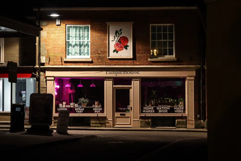
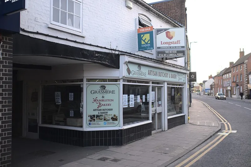
There is a moment in early November when a shop window looks better than it has all year. The sun is low, the glass is clean, and the graphics read crisply from the bus stop. Then the afternoon ends, the interior lights come on, and the whole thing turns into a dark mirror with a faint logo floating somewhere behind it. The pane has not changed. The light has.
That is the awkward truth about window graphics on a UK high street. You are not specifying for one viewing condition. You are specifying for at least two, and the second one is usually the one that pays the bills. People walk past your shop in the dark on the way home far more often than they stand outside it at lunchtime in decent weather.
Daylight flatters almost everything
A bright, south-facing window at 11am will make nearly any print look acceptable. The eye has plenty of light, the glass is behaving itself, and the contrast between the graphic and the interior is easy to read. This is why so many window schemes get signed off on a mild Tuesday morning and then quietly disappoint by the end of the month.
The trap is contrast that only exists in one direction. Dark type on a pale background works beautifully in daylight, but if the shop interior goes dark at 5pm, the pale background disappears and the dark type has nothing to sit against. The reverse is just as common: a pale graphic on clear glass looks elegant in the day and vanishes at night unless it is lit from inside or outside.
Designing on a monitor at 11am is not a test. It is a rehearsal for the easy shift.
Dusk is the only honest proof
If you want to know whether a window graphic will work, go and stand outside the shop at dusk. In a UK winter that means roughly 4pm to 5pm, depending on where you are and how grim the weather has decided to be. Stand where customers actually stand: the bus shelter, the opposite pavement, the loading bay across the road. Look at the window from ten metres, then from thirty. Then look at it while a car goes past with its headlights on.
What you are checking is not whether you like the design. You are checking whether the message survives. Can you read the offer? Can you see the brand? Does the graphic look like part of the shopfront, or like a rectangle of vinyl stuck to a mirror?
Do the same walk with the interior lights on, then off, then on again with the shutters half down. A window that faces both afternoon sun and a streetlight is being asked to do two jobs with one piece of material. It is worth an hour of your time before the artwork is booked in.
Opaque, translucent, and the reverse-view problem
Opaque vinyl is the straightforward choice when you want a solid block of colour or a clean message. It does what it says on the roll. The trade-off is that it also blocks the view into the shop, which can make a small retail space feel closed rather than inviting. On a busy high street, a fully opaque window can read as a hoarding rather than a shopfront.
Translucent vinyl lets light through, which is useful for frosting, etched-glass effects and softer branding. But translucent does not mean colour-accurate. Yellows and greens can shift noticeably when the light comes through from behind, and a colour that looked rich on the swatch can go thin and washy under a streetlight. If the colour matters, get a sample on glass and look at it at the time of day that matters.
Perforated and one-way vision films are popular for privacy and for wrapping a window with a big image. In daylight they can be excellent. At night, the physics reverses: if the interior is brighter than the street, people outside can see in. That is not a fault in the material, but it is a detail that should be in the brief before someone specifies a full window wrap for a shop that keeps its lights on until 9pm.
Backing and blockout are not footnotes
A lot of disappointing window graphics are not badly printed. They are badly backed. White vinyl applied over a dark interior will change apparent colour, because the vinyl is only as opaque as its backing allows. A grey backing layer can hold contrast much more predictably. For double-sided work, or anything that has to look right from inside and outside, blockout layers stop the design bleeding through and stop the interior showing through the graphic.
Blockout also matters for lightboxes. A backlit graphic is not simply a translucent print dropped into a box. Without the right blocking and diffusion, you get hotspots where the LEDs are, muddy darks and a colour temperature that fights the rest of the shopfront. If the box is old, the diffuser may be yellowed, and no amount of clever artwork will fix that.
Lightboxes are their own specification
Backlit media has to be tested in the box, not on a table. Dark blues and rich blacks are the usual casualties: they go flat, or they go patchy, or they develop a glow around the edges that nobody ordered. Pale colours can blow out. The LED spacing inside the box, the depth of the unit and the condition of the diffuser all affect what the customer sees from the pavement.
Ask for a small sample in the actual lightbox before the full run. If that is not possible, at least check the media against the box manufacturer's recommendation and look at a previous job in the same unit. A window graphic that looks superb in a flatbed proof and terrible in a lightbox is a specification problem, not a printing problem.
A pre-production check for a high-street pane
Before the artwork is signed off, run a short site check. Note the compass direction of the window and the time the sun leaves it. Note when the streetlights come on and what kind they are. Note the interior lighting plan for the evening, including any spotlights aimed at the glass. Check whether the graphics sit inside or outside the security shutter line, and whether the landlord has any views on film or vinyl on the glazing.
Then put a small sample on the glass and photograph it at 3pm and again at 5pm. Look at it from the pavement opposite, not just from the doorway. Check the reflection of the road markings, the shopfront and the bus stop. If the sample reads at both times, you have a scheme. If it only reads at one, you have a drawing.
The window will work two shifts whether you plan for it or not. Planning for the darker one is usually the difference between a shopfront that glows and a pane of glass with a rumour of a logo behind it.